Overview
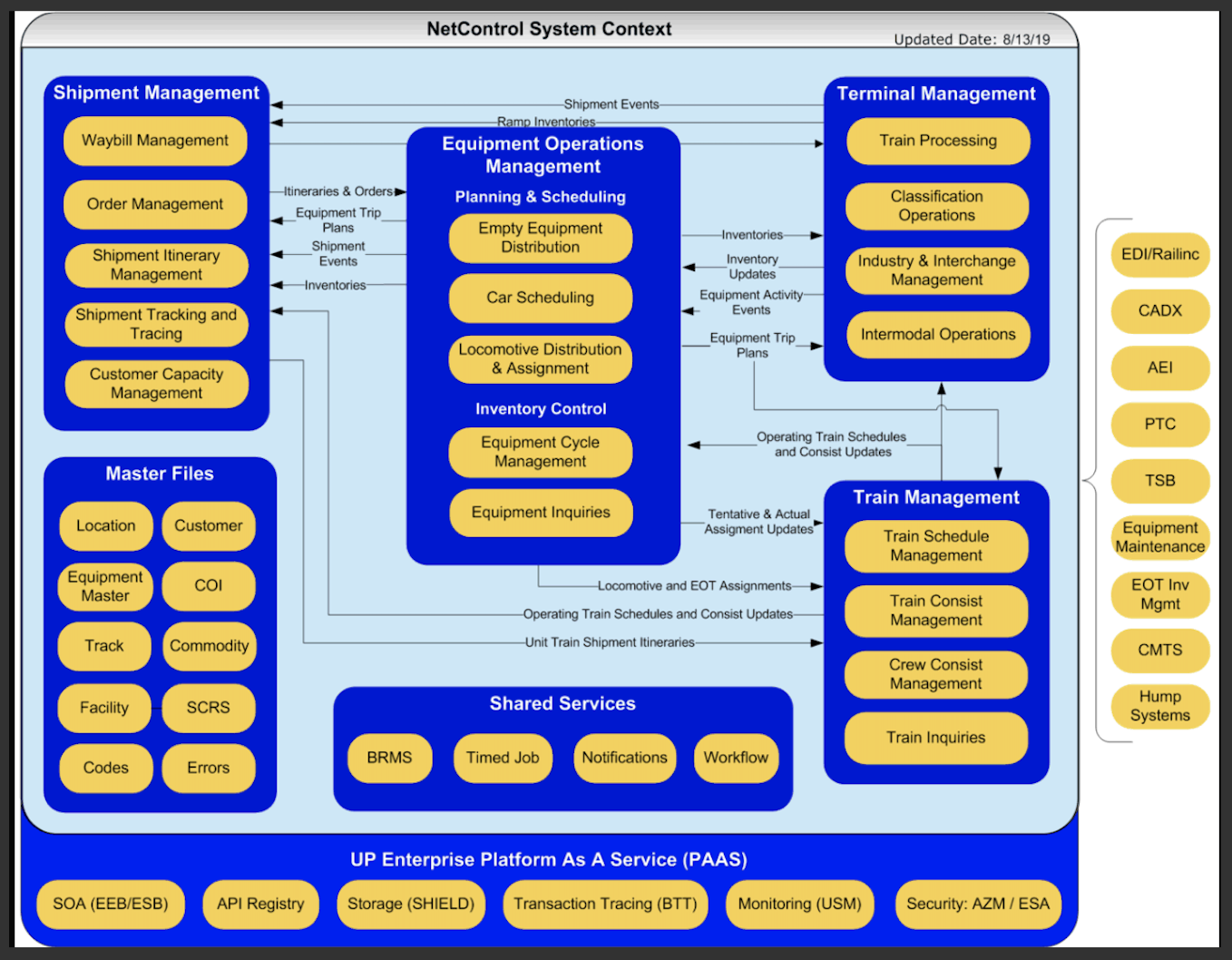
Unified Systems Management (USM) is an IT infrastructure-management platform for Union Pacific Railroad, one of America's largest freight railroads. Its job: surface the health of UPRR's sprawling systems in real time, alert the right team the moment something goes wrong, and get the right level of information to the right person so incidents get resolved fast.
The goals were concrete: reduce mean time to detection and recovery (driving higher availability), mitigate risk with real-time access to critical information, route alerts to the right support team based on root cause, and give every role the right altitude of data — from a single executive health score down to an engineer tracing a failing service.
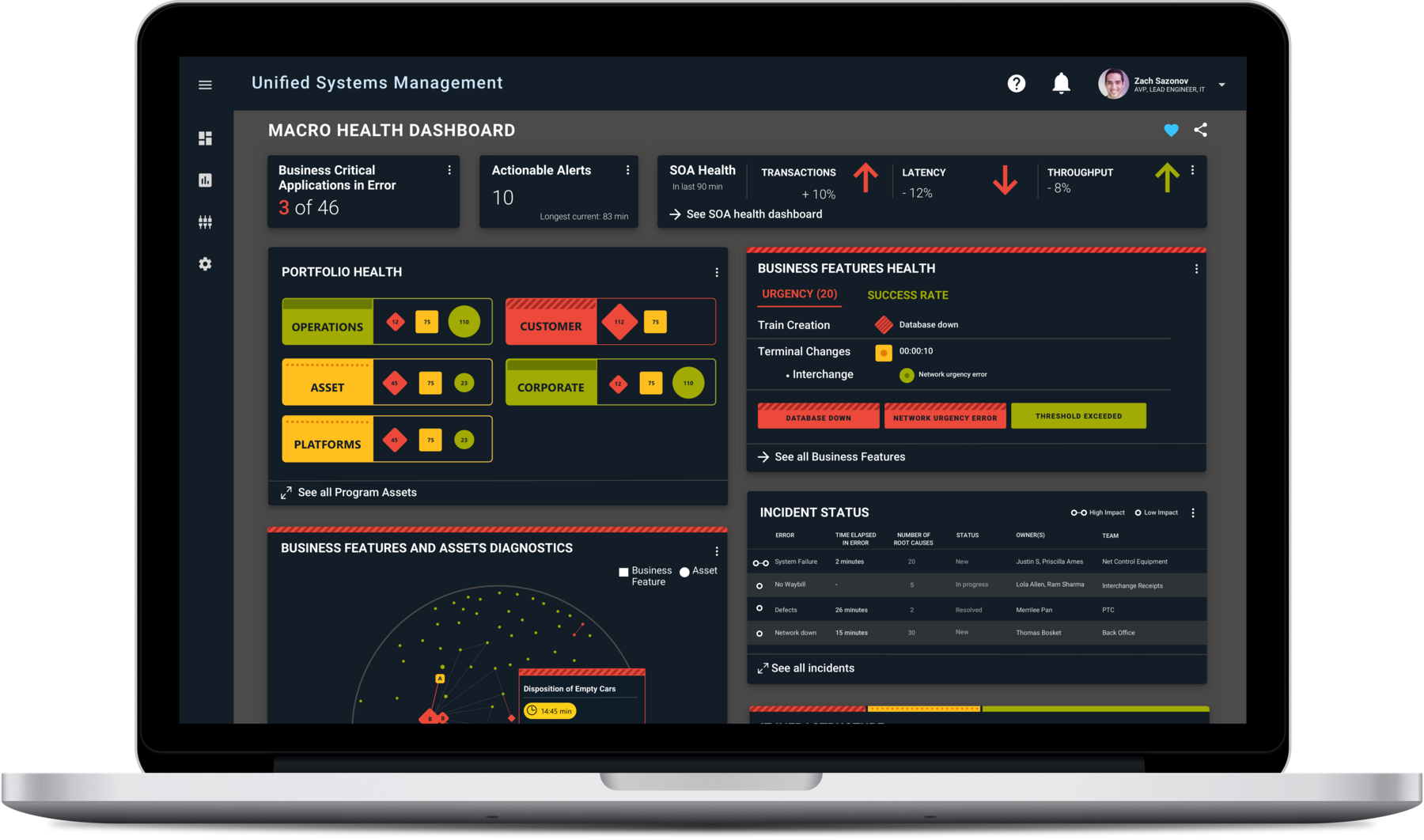
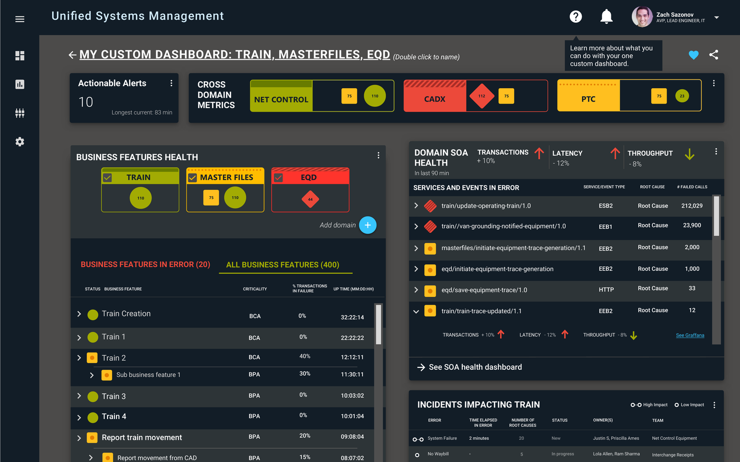
The USM Macro Health Dashboard — the entire enterprise's system health in a single, drill-downable view.
The Problem
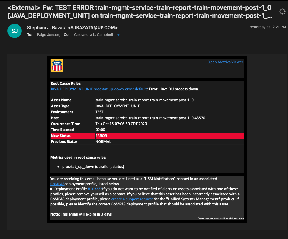
Research surfaced a blunt user truth: "Users don't trust the platform because they don't know where the data comes from — and they're overwhelmed by the spammy nature of the alerts." In practice, an outage flooded many engineers' inboxes at once with no clear ownership — they had to sort through a pile of alert emails just to understand what was actually down, with no visibility into whether anyone else was already working to resolve it. The platform wasn't just a visibility gap; it was producing active confusion at exactly the wrong moment.
And the underlying data, where it existed, was often unusable — complex service call-chains, for example, were rendered in a way that was virtually impossible to read.
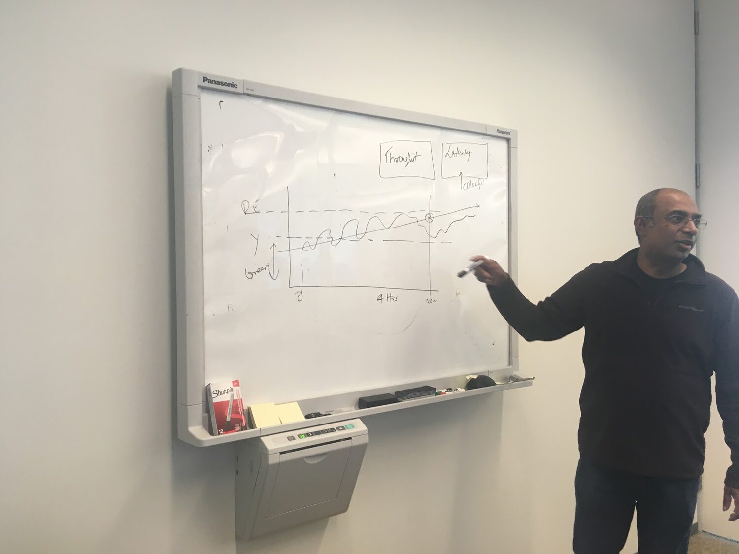
Dedicated alerting interviews made the fixes clear: the system needed to know when outages were planned — deployments, blackouts, grey-outs — so it wouldn't cry wolf; it needed dynamic thresholds rather than static ones; and notifications needed team-level enrollment, customizable down to the individual, to ensure accuracy, reduce noise, and get the right alert to the right person.
My Role
I led the design of USM and worked embedded with Union Pacific throughout — running the interviews and workshops, synthesizing the research, prototyping, and steering the executive reviews myself rather than through an account team. That direct access kept the designs grounded in how UPRR actually operated. Across the engagement I designed the platform's core surfaces — the Macro Health dashboard, the Domain Owner view, the Business Features (view and manage), and the alerting experience — and partnered with product and engineering to turn it all into a prioritized, buildable roadmap.
The Process
User interviews. I led interviews and workshops with internal stakeholders and the engineers who actually used the platform, surfacing where trust broke down and where the data fell short.
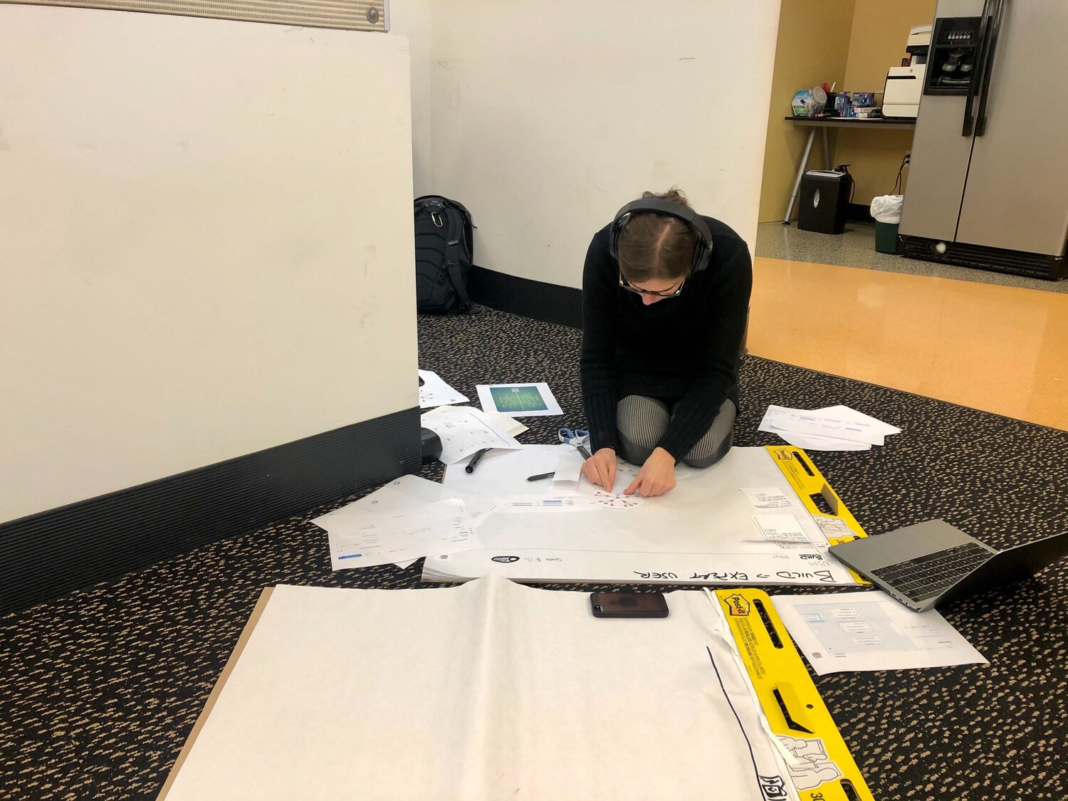
Synthesis & prototyping. I synthesized the research into design directions and prototyped fast — including on paper — to pressure-test ideas before investing in pixels. A competitive and comparative analysis of what already existed in the market informed the decisions.
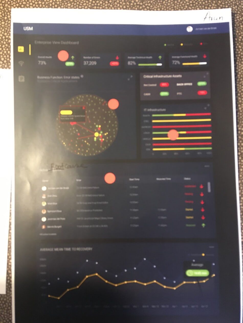
Executive review. I presented two concepts to the executives and ran a structured decision-making session: each stakeholder used voting dots to mark the pieces of each concept they preferred, and explained why. Overnight, I synthesized those insights into a single unified concept and presented it back to the team to confirm alignment.
Prioritization
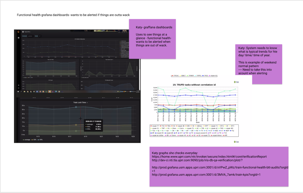
I organized the raw feedback into quotes and insights by team and theme — alongside screenshots of the reporting dashboards the train team relied on day to day — then worked with the client to prioritize: plotting user stories on impact versus effort, partnering with product to write and organize the stories, and working with the technologists to land on the best solutions to users' pain points.
Example of current reporting dashboards.
Wireframes
Before high fidelity, I worked the flows as wireframes — reframing those dense, unreadable call-chains into something a person could actually use. Here's the prototype in motion:
The Business Features wireframe prototype.
The Designs
Collapsing everything into one view would have caused alert fatigue and made the tool useless for everyone. So the platform served distinct roles with distinct views of the same underlying data — mirroring how UPRR itself was organized, which made adoption natural.
Here's how those surfaces came together in high fidelity.
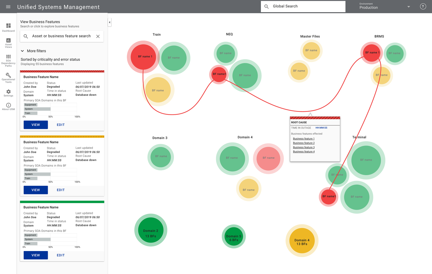
Domain Owner — a one-stop view of a domain's health, with jump-off points for diagnostics.
Business Features (View) — explore how services connect and trace a failure across the call-chain.
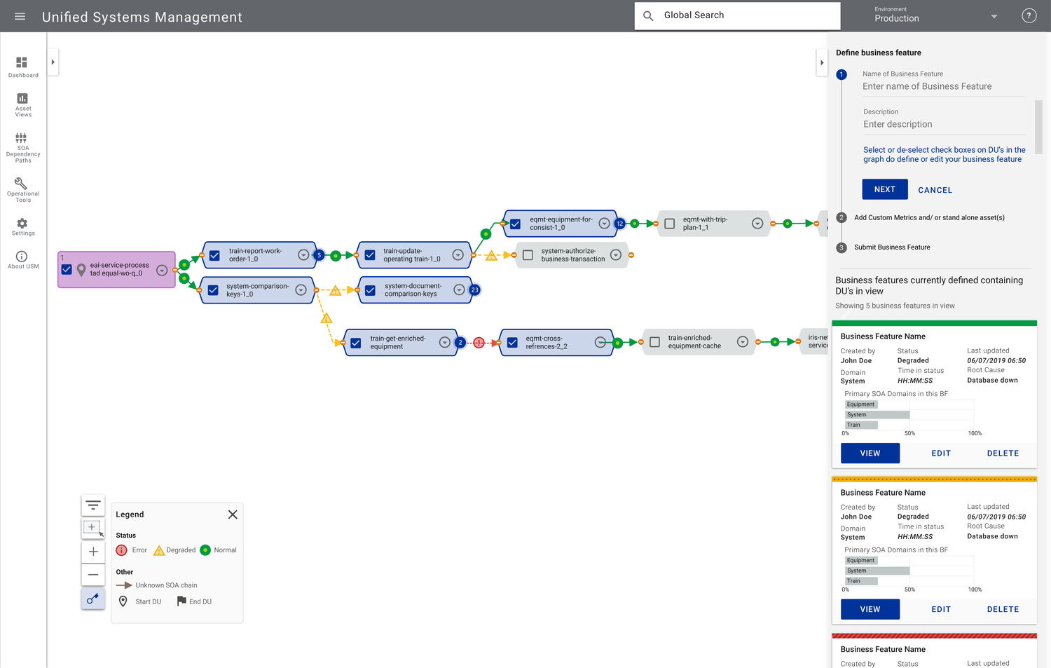
Business Features (Manage) — define and manage the lowest-level transaction patterns.
"I would love to understand how you come up with all of this because it is fantastic."
— Arun Giri, AVP Lead Engineer, Union Pacific
Outcomes & Impact
The executive and product teams were thrilled with both the work and the process behind the Macro Health dashboard — and the engagement was extended on the strength of it. The product genuinely worked: clearer ownership and prioritized, trustworthy alerts meant faster root-cause identification and less downtime.
"I love this process and I think you hit it out of the park."
— Matthew Kasselman, VP of IT Development, Union Pacific